Color – the vocabulary of photography. On the seventh photographic elements assignment I’ve realized that every element has a poetry equivalent that could have made this whole process easier for me to understand. Shape is the shape of a poem, made from line. Texture is the cadence, word choice can also suggest a texture through sibilance and stuff. Patten is the rhyme scheme, color is the vocab. Form is the only thing that’s a little different. The poetic form refers to the set of rules the writer used to produce a specific type of poem, while in photography is refers to the form of an object. There’s probably a better way to compare these two, but I think they are the most different compared with the rest of the elements.
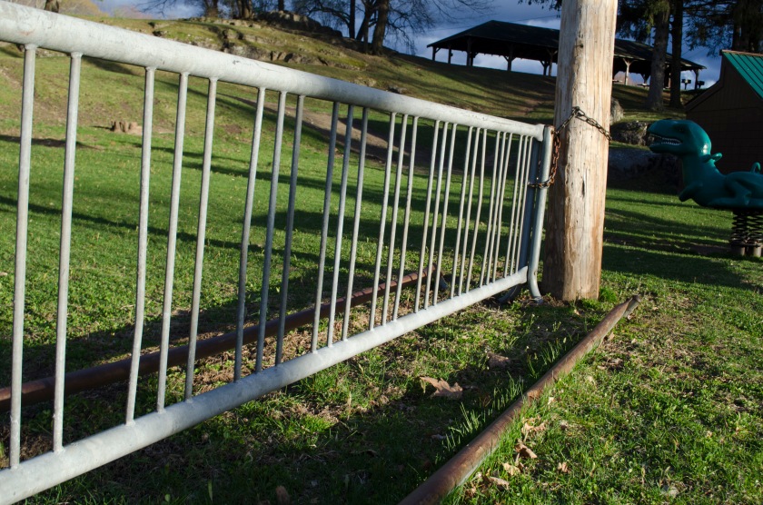
The color here probably isn’t the strongest element (maybe line?). The green is pretty striking, and I like how there are three different shades of green in it. It’s my attempt at a monochromatic piece. The line of the barrier is just so strong, it kind of overwhelms the color.
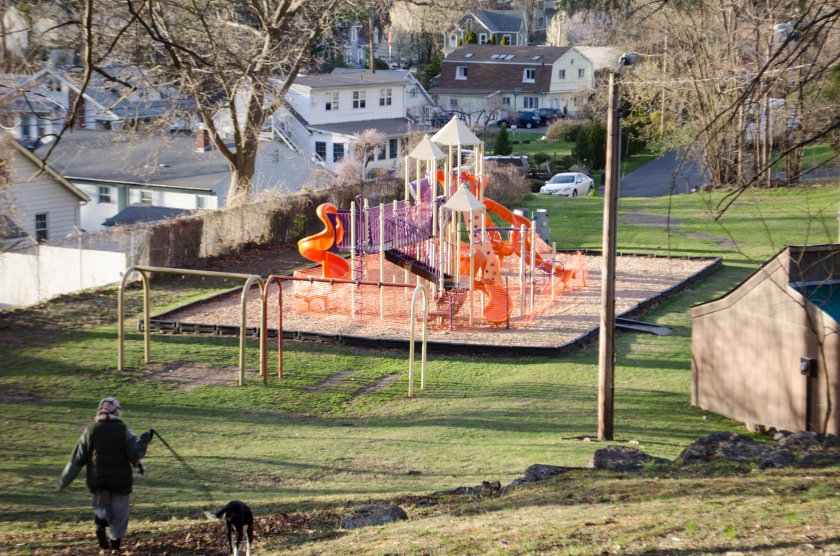
The bright colors of the castle make this seem like a real fantastic destination. It also looks illuminated by electric lights. It reminds me of a fast-food sign. Color can, of course, makes things pop, and that’s what it did here. Although, the tone as much as the color makes this pop.
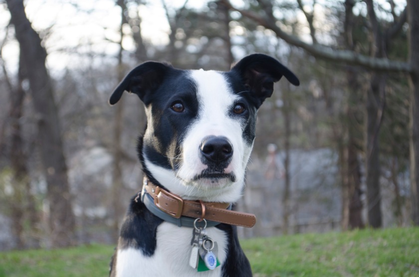
The colors here, along with everything else, are perfect. Look at this perfect angel. My muse.
